MICHAEL MUSER IS TELLING A STORY. Which is to say, a half dozen people sit in enthralled silence, as the partner of chef Curtis Duffy in the long-awaited ultra-fine-dining restaurant Ever acts out a piece of his life—acting it big enough for a theater several times the size of the room we’re in.
“I grew up as a kid in a ’77 Chevy stepside,” he begins the story in the middle. “And then Gail Rosetti across the street got a Mercedes Benz 560SLS, just like Eddie Murphy had in Beverly Hills Cop.” You remember it—the red Mercedes on the poster, with Murphy perched sassily on the hood. A car that looked like what it was to be the hottest star in America in the 1980s. “And she offered me a drive in it. I was in fifth grade, and I’m still talking about it and I’m 45 now.
“And I got in the passenger seat, and I shut the door on my very first European car. And the shhh-klump happened—” he gets the sound perfectly, and you hear the plushness of the rubber molding and the door fitting flawlessly into its frame, nothing even thinking of ever rattling loose—”when you shut that door. Everything about it acoustically allowed me, then, as a fucking fifth-grader, to look at the wood dash and enjoy it, and the smell of the leather, and how plush that carpet felt on my foot, and the ergonomics of all the buttons and the gigglybots on the dashboard.

“So to this day, I’m not a car freak but I love that stuff, I love it because acoustics played such a huge role for me in that Mercedes on that day. That story usually goes hand in hand with our bathrooms, because when you shut that door in a bathroom in a restaurant, it really needs to tell you in a hundred textural and emotional ways that this is your bathroom now, enjoy it, lock that door baby, experience it.”
Bathroom design is not where you expected an 80s story about a hot car and an older woman to go, I know. But in terms of sheer sexiness, the bathrooms at Muser’s previous restaurant, Grace, ranked high among Chicago architectural spaces, little temples for a moment of privacy sculpted to feel like windswept desert or snow-covered woods. Muser isn’t himself an architect or anything like it, he’s a restaurant manager. So’s Darren at the Village Inn on Route 29, but Muser is an especially rarefied sort, who aims to create an experience of such refined pleasures, such preternatural anticipation of your every need several moments before you even have it, that you look back on your three hours in his restaurant as one of the high points of your life.
Muser calls the components that create this experience “rabbit holes”—because that’s what he goes down each time, to figure out the best possible experience a guest could have at that stage of the meal. “That’s all I do, is force rabbit holes,” he says. “Walking into the restaurant, rabbit hole. How they get into the restaurant, rabbit hole. The tables, the chairs, rabbit holes. Ever presented us with an opportunity to try and find more rabbit holes.”
When Ever opens sometimes next spring, it will be the most ambitious fine dining restaurant in Chicago in at least a few years, maybe since Grace itself in 2010. It will be one of the most expensive restaurants in town, one of the most nationally publicized, one of the likeliest to get two or even three Michelin stars, to match the three that Grace had before its abrupt closing in December 2017. The sum of all its rabbit holes, thought through and expensively solved.
And what we’re talking about today, is a rabbit hole over the diner’s heads—and how it will be the locus of another rabbit hole, which is managing the noise level in the restaurant. “The ceiling is a huge rabbit hole,” Muser says. “Let’s go there, and just find a way to totally coosh this room.” In other words, use the ceiling to make a restaurant as acoustically sexy as Gail Rosetti’s Mercedes Benz 560.
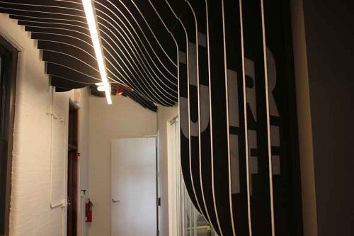
YOU MAY WELL HAVE NOTICED TURF’S BUILDING, an 1890s firehouse just west of the expressway on Belmont. An attractive old brick building that looks like it would have made a pretty fun restaurant space, except for one insuperable problem: parking (it has next to none).
Turf, just three and a half years old, came into existence as a business because of two things. One was a new material on the market, boards of colored synthetic felt, made from a plentiful and sustainable source: recycled plastic water bottles. The other was a trend in office space—open office plans.
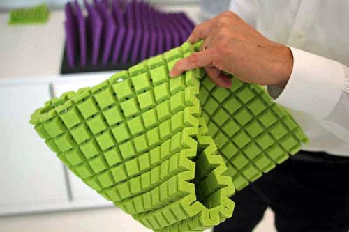
“The architectural trend for open offices was creating a scenario where no one could actually focus on their work, because the acoustics were so bad,” explains Dustin Headley, Turf’s director of product design and development. That led them to search for a material that could dampen sound and be manipulated into whatever shape an architect or designer wanted. “Once we found the felt that we could get in boards, that provided us with a medium that we could manipulate through folding or cutting, to either get the volume to solve acoustic problems, or to maintain whatever aesthetic the architects or specifiers desired.”
The colorful boards are rigid:
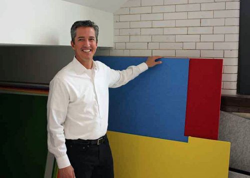
General manager Rob Perri with the felt boards
Yet cut them at different angles and they can form countless shapes:
The key to manipulating the felt is a device known as a CNC machine, for “computer numerical control”—basically, a kind of flatbed robot, which can follow a digital design precisely (and, if needed, thousands of times, to 1/10,000th of an inch accuracy) to cut anything from plywood to steel. We’re in a room used for demonstrating and prototyping (the actual production facility, with much bigger CNC machines, is in Elgin), the wall decorated with samples that Headley calls “the periodic table of felt.” He calls up a design and slides a piece of blue felt onto the table.
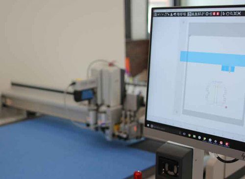
For the next couple of minutes, the machine whirs, slicing its way very precisely across the felt, a single laser dot helping it orient itself. When I get too close with my camera, the machine suddenly stops, which is hard not to take as a rebuke. “Robots are scary,” says Tyler Yager, one of the designers.
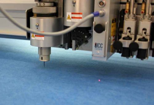
“Light barriers basically prevent you from doing anything that might cause you physical harm. You can hurt yourself, but you have to try harder than that,” Headley says. “The upper part has whacked me a few times, though.”
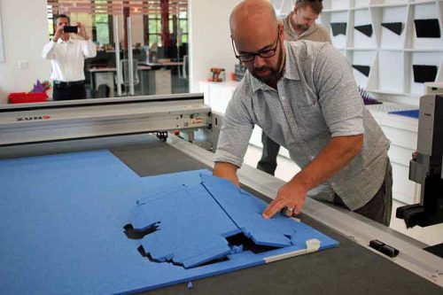
Dustin Headley pops out the cut shape
In a few minutes the machine has cut out what looks like a small briefcase—and, as Headley folds it into shape, even the clips that hold it snugly together are cut from the felt, and fit together perfectly flush. He assembles it into its shape, and then attaches it to a metal clamp, from which it hangs.
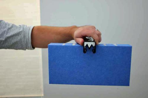
“This is basically the ceiling at Ever,” he says.
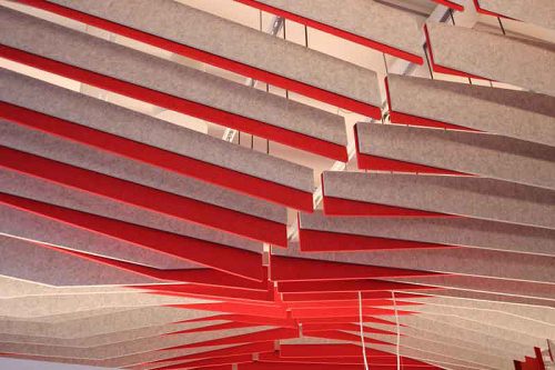
TO SEE THE INITIAL SOLUTION TURF OFFERED, you have to go no further than the next room at Turf—an open office full of designers and technicians. Above the desks and computers there’s a series of hanging red and gray strips of felt—baffles—arranged in a way that reminds me of the “sails” on Santiago Calatrava’s Milwaukee Art Museum. Each pair of baffles is a few inches from the next, revealing the hard surface ceiling behind it—but even so, the arrangement is enough to break up the sound waves before they hit the ceiling, and keep them from turning the room oppressive with noise.
Rob Perri, the general manager, takes a whack at explaining acoustic science to me. “How baffle systems work, is a function of spacing, depth, and literally air space in between and within the baffle,” he says. “So we have calculations that we run, so if we get the size of a room, we understand what the ceilings are made of, what the floors are made of, what the walls are made of, and there are calculations that are industry standard that we put in for these noise reduction coefficients. Then we can calculate the room, and we also know through testing, how our baffles will react. So we basically look at the room with baffles and without, and you can measure the difference to get rough noise reduction.”
It’s quiet, but it’s not eerily quiet—there’s what seems a modest, livable level of hubbub. “Each space has a noise criterion that acousticians have established, that’s an appropriate decibel level for the functions of the space,” Headley explains. “When you’re in an open office, the noise criterion is 40. And the speech range actually sits just above that. So our product actually brings the decibel level down into the criterion range, so that you’re able to work and function. Because if you take away all the noise, then people get uncomfortable in the opposite direction.”
So that’s most of what Turf has done so far—responded to the problem of open plan offices, often in older downtown buildings with hard surfaces (“Your major workforce is in the city now and wants to be in the city,” Perri says). But offices aren’t the only spaces with noise problems—or a desire to solve them in a way that is exciting from a design perspective.
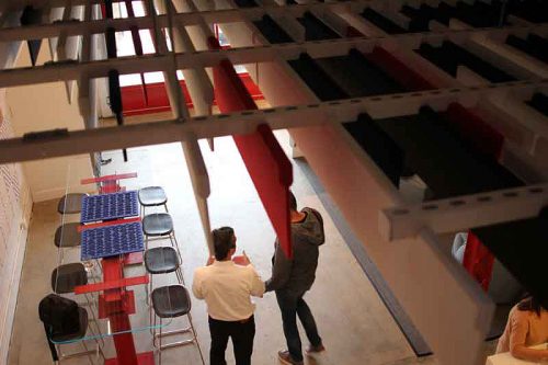
A SHORT HISTORY OF SOUND LEVELS IN CHICAGO RESTAURANTS: there was a time when fine restaurants wanted to feel like getaways for the wealthy. There was carpet, and music, and space between tables, and an air of faux Frenchness. They fetishized a certain reserve—Jovan Trboyevic issued membership cards at Les Nomades, so he’d have something to tear up if you got too loud, or dared work the room by talking to someone at the next table.
But in response some restaurants chose to be part of the busy, noisy city. Take Blackbird—tall windows open to the street, tables close together creating a busy hubbub. Boka restaurants are big and bustling, like miniature cities themselves.
And then there was a counterbacklash. Alinea was an early model for this; before its renovation a few years ago, you entered via a darkly lit, angled entry deliberately designed to disorient you from the outside world. So your experience started once you were freshly delivered into an environment cut off from Halsted street. At Oriole, you pass through a freight elevator—literally disconnected from the earth—and take a moment to relax with a welcoming glass before passing into the dining room. In other new restaurants—Los Angeles’ Vespertine, Sonoma’s Single Thread—the separation from the outside world is even more elaborate. You’re not just sheltered from the world, you’ve left it entirely, for Planet Vespertine. Or as Muser calls it, the Food Spa.
They deserve and need an environment that looks and feels and sounds and goes, ‘Hey. Hey dude. You’re here! You made it, through the traffic and all the bullshit. Come here.’
Those are the restaurants that Ever will be up against when it opens, and a vanilla box inside a Sterling Bay development in the West Loop isn’t as instantly entrancing as Vespertine’s spaceship or Single Thread’s farmhouse. So Ever will use all the tricks of modern restaurant design to separate you from the outside world and bring you into one of their own making. You’ll pass through an entrance that Muser compares to a narrow canyon, before entering a dining room that seems sculpted to shrink the world to the intimacy of your table, your experience. Including a sculpted sound experience, that delivers that shhh-klump!
Christopher Lawton is Ever’s architect—he was Grace’s, too. And what appealed to him about Turf’s solutions was less that they worked acoustically—every acoustic solution presumably works—but the variety of design possibilities that the CNC manufacturing process offered in combination with such a flexible material.
“The old model of trying to come up with a component that repeats itself is no longer critical,” he says. He means standardized components, like bricks which are always the same size, tiles that are always the same size, repetition defining the design. But the CNC process means you can not only make the same piece over and over if you want—you can also make each piece slightly different, creating a pattern out of the variations. Change defining the design.
“We can have a different piece on every spot, and with the CNC, it doesn’t really cost that much more to do that. It’s something that we’ve always been very interested in, and you’ll see components of that in all of our designs,” Lawton says.
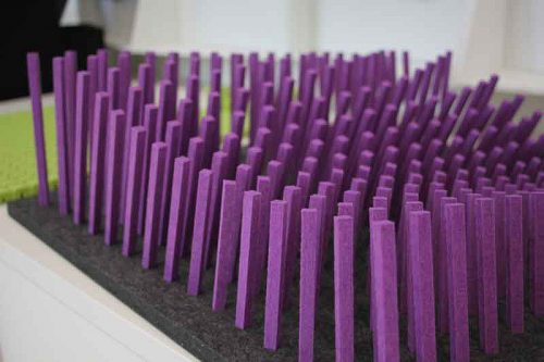
“There’s no standard standard,” Yager says. Each piece can be a unique length—as they are in the board of spindle-like pieces, creating a flowing design from one end to the other. “And going to the digital fabrication side, we can then number every single one, and we can make coordinated drawings to make them really easy to install,” he says.
Okay, so you can do all that, but why would you? Ever’s design is still under wraps, but Lawton shows me a rendering that shows how the ceiling will work as part of the dining room. Like the exterior of Jeanne Gang’s Aqua building (also made possible by computer design), it flows and undulates in a way that is undeniably sexy. The components of that are the box that Headley had shown me earlier, except instead of being the size of the “briefcase,” the forms will be made of long sections, butted up together to such high tolerances that they will seem continuous for the length of the room.
Of course, as anybody who’s rehabbed a house knows, construction is nowhere near as precise as a manufacturing process, so the perfection of the fabricated materials has to compromise with the imperfections of the real world.
“The challenge is getting those things to meet,” Headley says. “The CNC process gets us to about a 10,000th of an inch in terms of the accuracy, but having somebody subsequently build a building to that tolerance—that has never happened.”
“We try to have areas in the design where the tolerances can be, expansion joints or a light pocket on the perimeter, as opposed to the center where we don’t want any gaps,” Lawton says.
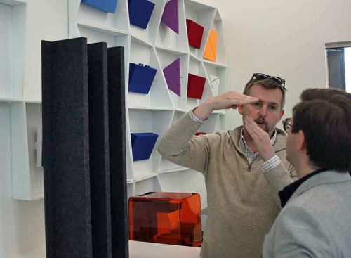
Christopher Lawton and Tyler Yager look at a prototype of the ceiling baffle
In the end it’s all about hiding things—sound, of course, but also light fixtures, sprinklers, speakers, who knows what all. “If there’s a way to have those lights—I don’t want to say hidden, but not as prominent within the space, all the better,” Lawton says. “If it doesn’t go to the de facto cans in the ceiling, all the better as well. And when you have the solution that we came up with, the baffle, it gives you a space that can light things, ideally a table, as a piece of art.”
Muser jumps in. “There’s all kinds of unavoidable uglies that you’re always going to have to have—can lights, exit signs. And no matter how sexy the light fixture they show us, they’ve got some kind of connective material to the ceiling that usually is a unit that you don’t want involved in the process. Having these baffles come down not only gave me a rabbit hole of acoustic stuff I could run down, but we can hide everything up there, and then the ceiling will be this seamless little pretty brrrpt! right across it.”

Lawton and Muser with the Turf team
WE’RE UPSTAIRS, IN AN OPEN SPACE with a kitchen that Turf sometimes uses for events—they’d just hosted some designers from NeoCon, the annual design show at the Merchandise Mart, with Top Chef winner Joe Flamm cooking for them. That brings back memories for Muser.
“I used to work across the street from the Merchandise Mart at a restaurant called Kinzie Chop House,” Muser says. “I waited tables there in the off season when I wasn’t working the wine harvest in France, and I’d come back to Chicago, and NeoCon was just nine days of, your ass in your uniform and you don’t wash nothin’, you’re just there, you work double after double after double. I’d make like five grand, and then I’d run back to France.”
Lawton, who knows Muser and Duffy’s history with the owner of Grace and could tell you a thing or two himself, says, “We’re taking Curtis and Michael’s journey and path, and its ups and downs through this industry, and incorporating that as an idea within the space. Our first job in this industry was with them, nine years ago.”
“A lot has changed,” Muser says. “We didn’t go far enough, with Grace. I realized that, after we opened.”
“In terms of design?” I ask. “You wish it had been weirder and more out there?”
“Sure,” he says, “but it’s not just about how it looks. When people are paying that much money for dinner, and you’ve made this reservation so far in advance, and you’ve made your way through the West Loop—and try not to raise your blood pressure doing that, it’s just crazy getting around the city now, Uber or no. And they walk in. And they deserve and need an environment that looks and feels and sounds and goes, ‘Hey. Hey dude. You’re here! You made it, through the fucking traffic and all the bullshit. Come here,” and he pantomimes giving his guest a hug.
“And restaurants like ours can be, like, onnh-honnh,” he does a French waiter’s accent. “‘You’re welcome. We’re going to serve you tonight. You good with that?’ Restaurants can be such intimidating environments. Don’t use the wrong fork. Here comes more silverware. Phone book sized wine list that gets put in front of you like you’re going to make your way through four pages of Grenache. That’s the old school kind of mentality, and fundamentally, a lot of it is not friendly.
“We have a lot of traditions that we’re still following in that area. But we’re going to be about slowly getting someone into our house, and making sure that they’re loved and cared for—”
Lawton says, “And changing their mindset to be aware of the things that are actually in the space, the food and the dishes and everything. Visually, tactilely, acoustically, everything you’re aware of is different from where I’ve just been. Grace was more dining as theater, you were directed to look toward the lit-up kitchen. This is going to be different—there will be sensory input all around you.”
There’s someone we’ve hardly mentioned in all this, and that’s the celebrity chef, Curtis Duffy, for whom all this is being constructed. As if he senses that, Muser sets the scene with his chef in place. “At the end of the day, when those captains come, and they throw china in front of the client, we have to play the song that is Duffy. We have this craaaazy guy in the kitchen, and he’s doing these amazing things, and we have to put it in front of someone so that the world is gone, and it’s just about those ingredients. Because that’s what they’re paying for.”
Michael Gebert is the big noise of Fooditor.
Latest
Join the Discussion
After you comment, click Post. If you're not already logged in you will be asked to log in or register with Disqus.


